Collage
This design project involved gathering a few different photos and splicing them together to create a new environment. In the first composition I did (which was of a space turtle) I spliced together the photos of a man with a flashlight, the moon, the surface of earth, a mountain range under a starry sky, and an astronaut.
The second composition I did (the galaxy gateway) was made up of photos of a lion, little child, a galaxy, birds flying, a moon with a jet flying below it, and a picture of a man walking towards two pillars. All the photos spliced together showed a scene of some kind of traveler entering another dimension with a loved one running after him with the added elements of birds, a tiger and a jet with a moon.
The last composition I did (statues in lake) was made up of photos containing lightning, statues of presidents, a flamingo, an old car, water ripples, a man in a trench coat, and a guy riding his bicycle through a misty forest near a lake. Spliced into a single photo, the scene depicts a dark wasteland with mysterious people roaming the land.


Charity posters
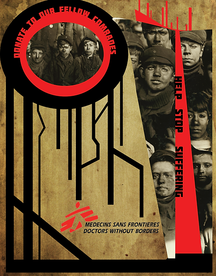
This project had me make poster designs for a specific charity in three distinct design styles. The first design style I used was called Russian Constructivism. I made this specific design to mimic the side of a person's face with tears streaming from their eye and frowning while a scar on the side of their head oozed blood. I also added papyrus texture to give it a worn look to emphasize the hardship the boys in the pictures must have felt.
The second design I made was in the Bauhaus design style. In this composition I wanted to emulate the colliding shape and linear feel I got from the design style. I moved the shapes around until I was happy with one specific pattern. I then added in the text and photos of child workers named breaker boys. I added in textured paper to give the design a more worn out feeling like the design above and lastly I added in the logo of the charity. Once the design was finished I decided to add to other photographs to make compositions showing how the poster would look like if displayed in real life.
The final design I made was in a style called heroic realism which was mainly used for propaganda posters where they emphasized a person into being an ideal such as Uncle Sam. I found a photo of a breaker boy looking out into the distance and began to use the brush in Photoshop to paint over him to give the image the feeling that it was a painting. Once I was finished I decided to add in a border to make the image appear like a portrait. I then added in the text with the phrase of the poster being only you can help the cause, which was meant to mimic the propaganda posters of Uncle Sam. The other bit of text was used to show the charity the poster represented while the logo was also present up above. Lastly, I put the finished design into a composition to see what it would look like in the real world.


Advertisement
This composition was made for an advertisement poster design. I decided to make my design for an airline company called Yalta. So I spliced together a total of three photos together, which was of birds, a plane, and a girl running during a sun set. I spliced the three together to emphasize the fly aspect of the poster where you get the sense that the girl is mimicking flight from the birds and plane. Lastly, I added the text to be sort of fancy and wispy in nature, with the content of the advertisement establishing a friendly relation with the consumer.

Art Deco
This composition was for a project called art deco. The design was meant to evoke the intricate geometric designs of the roaring twenties such as the Great Gatsby. I began this design by just designing on the left side of the page, using boxes of various designs to get a pattern that I was happy to see. I copied the design on the left and pasted it to the right to get the final product. Lastly, I added a gradient highlight and a phrase in the middle with futuristic text since the whole pattern has a future vibe to it like a circuit board.

Face Swap
This composition was a part of a face swap project. I had a photo of child workers called breaker boys and swapped three of the boys faces with famous actors such as Johnny Depp, Caleb Mclaughlin and Finn Wolfhard.

Book Cover
In this project I had to come up with a design for a book cover. At the very start I wanted to design a cover for one of my favorite book series, Stephen King's the Dark Tower. I began the project gather a series of photos that I could splice together. I ended up taking photos of a skyscraper, birds, a mountain range with a man on horse back, clouds, and a man merely standing up. I merged all the photos in one; the man on the horse represented the book's protagonist, Roland Deschain, and the man standing up represented the antagonist, the man in black. The skyscraper was meant to be the dark tower looming in the distance and the birds were meant to represent the evil that followed the man in black. After the photos became one, I began working on the type of text that would show up on the cover. I had the idea for the title that the "r" in Gunslinger would be a revolver since the protagonist uses revolvers. After I made the title and the author's name, I put them onto the cover in photoshop and added a little texture to the title to give a worn feeling since the book takes place in an apocalyptic setting. I then placed in other bits of text on the back of the cover and front. The back text was the first line of the book, which is quite a famous first line in Stephen King's stories. The other bit of text on the front was merely to say the series name which is the dark tower. The style of these texts is also worn and cracked to give it a feeling of decay in an apocalyptic world. After I had completed the design I decided to put the book cover in a few photo compositions to display what it would look like in the real world.


Animation
This was an animation I did for an animation project. I merely decided to animate a story about a knight facing a dragon.
Geometric Portrait & Magazine cover
I made this design for a project called geometric portrait and for a magazine cover project. I decided to make the portrait of my favorite actress Audrey Hepburn. The process of this design was long and repetitive, but nonetheless the end result was well worth the effort as I really like how it turned out. The process itself consisted of making different shapes according to the various different colors in the photo. The next step I took was to put the portrait design on the cover of a magazine, which I decided to make about philanthropy since Audrey Hepburn did much to help others.


