The Grand Crane
So I started this design wanting to make a logo for a casino. I brainstormed what would be appropriate for the idea I had in mind because I wanted the logo to be an animal. I came upon a small fact that in Chinese culture, the crane symbolizes good luck and from that I decided on using a crane. The compass star design came later in the process and the reason I used was merely to make the design more aesthetically pleasing but simple. Lastly, I wanted the type to be fancy and professional hence why grand, hotel and casino is in simple text while crane is more fancy for the good luck aspect of the animal.


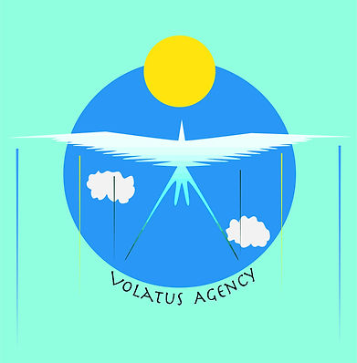
I started this logo with the idea for a skydiving company in mind. I decided to use a bird in flight to emphasize the sky aspect of the logo and add in a sun and clouds. Lastly, I used the Latin word "Volatus" since it translates to flight in English, which I thought it was very fitting for a skydiving company.
Crashing Waves
This design was for a water park and I decided to use a whale jumping out of water while shooting water from its blowhole in a cartoon style to emphasize fun and joy. The text of crashing waves is also made to be wavy to give the feeling of water to add to the cartoon aspect of the logo.

Moon Walkers
In this project I decided to do a shirt design for a space agency such as NASA. In this particular design I decided to add a more friendly and fun tone with the astronaut and alien holding hands on the moon, sort of to evoke an E.T. vibe. I also added a Sputnik satellite to give the design a more old school space feeling.

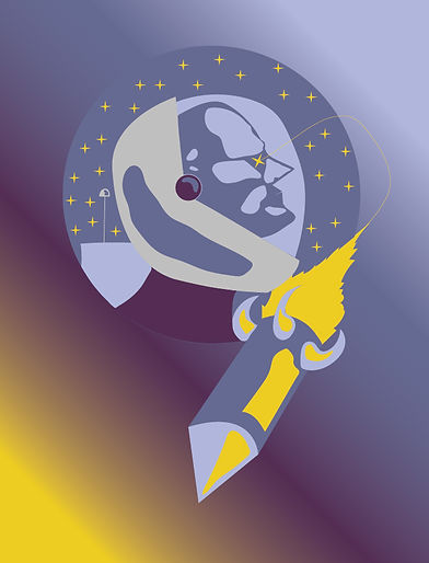
Star Gazers
This is also a design I made for a t-shirt project. I wanted this design to evoke the sense of wonder and aspiration that came about during the space race, where Americans looked up to the final frontier hence the astronaut looking up to a galaxy filled with stars. The rocket ship also represented the old school era of science fiction since it has that 1950-60s design of a space shuttle.